Sakura Posted December 30, 2024 Share Posted December 30, 2024 10 hours ago, Animedragon said: This one came out a little bit larger than I intended. Wow looks so good I love all the different aspects of it with all the different renders you used. & yes definitely love that book effect you used ~ 1 Link to comment Share on other sites More sharing options...
Animedragon Posted December 30, 2024 Author Share Posted December 30, 2024 Thanks @Sakura, @Sasuke, @Sarada and @Zeref for all your kind comments about my latest GFX creation. I had a lot of fun putting that together and fitting all the parts together, the book effect was done using another one of the Photoshop actions I got from PanosFX. 1 1 Link to comment Share on other sites More sharing options...
Popular Post Animedragon Posted January 3, 2025 Author Popular Post Share Posted January 3, 2025 This is my latest creation, I had a lot of fun making the background for this one. 3 1 1 1 Link to comment Share on other sites More sharing options...
Sarada Posted January 3, 2025 Share Posted January 3, 2025 45 minutes ago, Animedragon said: This is my latest creation, I had a lot of fun making the background for this one. Nice work I dunno why but the background reminds me of the Lion King 1 1 Link to comment Share on other sites More sharing options...
Fluff Posted January 3, 2025 Share Posted January 3, 2025 Hello Have you tried using adjustment layers in photoshop? I think they will be great to bring some sort of unity in terms of lightning, contrast, colors. The characters, the text and the sky are in the same chromatic area, but the road and the trees are really different. I like the fact that you're not scared to work on larger images and I feel like you are a really creative person just by the way you think about putting together those elements. I also love card captor Sakura 1 Link to comment Share on other sites More sharing options...
Zeref Posted January 4, 2025 Share Posted January 4, 2025 4 hours ago, Animedragon said: This is my latest creation, I had a lot of fun making the background for this one. Looks great I like how the text and everything matches with this background you chosen. 1 1 Link to comment Share on other sites More sharing options...
Sakura Posted January 4, 2025 Share Posted January 4, 2025 6 hours ago, Animedragon said: This is my latest creation, I had a lot of fun making the background for this one. Cute renders~! I also like the text choice and the road that stretches back into the setting sun. Gives that traveling/searching vibe for the theme. 6 hours ago, Sarada said: Nice work I dunno why but the background reminds me of the Lion King This was my first thought as well omg lol ~ it's totally giving Lion King vibes and I don't know why all I can think of is the NANTSSSS INGONNNYAMAAAA BAGITHIIII BABAAAAA which is TOTALLY NOT the theme here but honestly thinking of that randomly starting to play with this scene of these 2 makes me cackle XD In case @Animedragon is totally confused what we are on about, the background looks like the opening scene of the movie The Lion King which looks like this: Spoiler 1 Link to comment Share on other sites More sharing options...
Animedragon Posted January 4, 2025 Author Share Posted January 4, 2025 4 hours ago, Sakura said: Cute renders~! I also like the text choice and the road that stretches back into the setting sun. Gives that traveling/searching vibe for the theme. Thank you @Sakura. The road stretching back into to setting sun giving the 'searching for' vibe was the idea in my mind when I created the piece so I'm really glad it came across, I was a little worried that it didn't. 4 hours ago, Sakura said: This was my first thought as well omg lol ~ it's totally giving Lion King vibes @Sakura and @Sarada, yes I see where you got the Lion King vibe from, I've seen the movie too . My first thought was to have a night sky at the end of the road, but I decided on the sunset because I thought it a more powerful image for the theme. 1 1 Link to comment Share on other sites More sharing options...
Sasuke Posted January 4, 2025 Share Posted January 4, 2025 21 hours ago, Animedragon said: This is my latest creation, I had a lot of fun making the background for this one. Cool sig I like the background. Did you try making two versions of it? Maybe one with the night sky you suggested? 1 Link to comment Share on other sites More sharing options...
Animedragon Posted January 4, 2025 Author Share Posted January 4, 2025 1 hour ago, Sasuke said: Cool sig I like the background. Did you try making two versions of it? Maybe one with the night sky you suggested? Now that's a good idea, I'll try that. Thanks. Link to comment Share on other sites More sharing options...
Sakura Posted January 5, 2025 Share Posted January 5, 2025 17 hours ago, Animedragon said: Thank you @Sakura. The road stretching back into to setting sun giving the 'searching for' vibe was the idea in my mind when I created the piece so I'm really glad it came across, I was a little worried that it didn't. @Sakura and @Sarada, yes I see where you got the Lion King vibe from, I've seen the movie too . My first thought was to have a night sky at the end of the road, but I decided on the sunset because I thought it a more powerful image for the theme. I like the version you did, it just definitely reminded me of that Lion King scene but I bet night sky would be very cool to see too ~ 1 Link to comment Share on other sites More sharing options...
Animedragon Posted January 5, 2025 Author Share Posted January 5, 2025 5 hours ago, Sakura said: I like the version you did, it just definitely reminded me of that Lion King scene but I bet night sky would be very cool to see too ~ Watch this space, I'm going to have a go at doing just that this afternoon. 1 Link to comment Share on other sites More sharing options...
Popular Post Animedragon Posted January 5, 2025 Author Popular Post Share Posted January 5, 2025 So hear it is, by popular request a night time version of the sig. I changed the text colour to match the night time feel. 1 1 1 1 1 Link to comment Share on other sites More sharing options...
Sarada Posted January 5, 2025 Share Posted January 5, 2025 57 minutes ago, Animedragon said: So hear it is, by popular request a night time version of the sig. I changed the text colour to match the night time feel. The nighttime version looks equally as good. I'm not sure which I like more but I think I'm leaning to the night version. 1 Link to comment Share on other sites More sharing options...
Zeref Posted January 6, 2025 Share Posted January 6, 2025 3 hours ago, Animedragon said: So hear it is, by popular request a night time version of the sig. I changed the text colour to match the night time feel. I like both versions for me I think I liked sunset version better by a little. 1 Link to comment Share on other sites More sharing options...
Sakura Posted January 6, 2025 Share Posted January 6, 2025 6 hours ago, Animedragon said: So hear it is, by popular request a night time version of the sig. I changed the text colour to match the night time feel. I like the night sky version too, veryyy pretty I'm not sure which I like better.. I think I like the sunset one just a tiny bit more though, however both are lovely. 1 Link to comment Share on other sites More sharing options...
Animedragon Posted January 6, 2025 Author Share Posted January 6, 2025 Thank you all for your comments about my latest GFX, and special thanks to @Sasuke for suggesting I do the night time version. I can't make up my mind which I like best because they both have their good points. 1 1 1 Link to comment Share on other sites More sharing options...
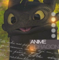
Animedragon Posted January 11, 2025 Author Share Posted January 11, 2025 I thought my sig was a bit plain and dull, so I smartened it up a bit and made a matching avatar. Link to comment Share on other sites More sharing options...
wildberrydraw Posted January 11, 2025 Share Posted January 11, 2025 I really like your meticulous approach to work. Keep it up! Short friendly recommendations: Please note that the highlights on your characters are bright, while the background you've chosen is dark and doesn't quite match the palette. Try using a cooler and lighter shade so that the characters blend better with the background. The same goes for the trees. Probably you should also adjust the position of the text. Try using the boy's shoulders as a reference. The words "always" and "for" fit well along the horizon line. Try to make these adjustments to see how your art can transform! 1 Link to comment Share on other sites More sharing options...
Animedragon Posted January 12, 2025 Author Share Posted January 12, 2025 10 hours ago, wildberrydraw said: I really like your meticulous approach to work. Keep it up! Short friendly recommendations: Please note that the highlights on your characters are bright, while the background you've chosen is dark and doesn't quite match the palette. Try using a cooler and lighter shade so that the characters blend better with the background. The same goes for the trees. Probably you should also adjust the position of the text. Try using the boy's shoulders as a reference. The words "always" and "for" fit well along the horizon line. Try to make these adjustments to see how your art can transform! Thanks for your helpful comments, I see what you mean about the highlights and those trees in the foreground do look a bit too bright now I come to look at it again. I think I'll re-visit the idea behind that piece a bit later on. 1 Link to comment Share on other sites More sharing options...
Digimon_Sommelier Posted January 12, 2025 Share Posted January 12, 2025 It's very realistic, I'll say. A red dragon... I can tell it took a lot of concentration and dedication to draw. Link to comment Share on other sites More sharing options...
Animedragon Posted January 12, 2025 Author Share Posted January 12, 2025 7 hours ago, Digimon_Sommelier said: It's very realistic, I'll say. A red dragon... I can tell it took a lot of concentration and dedication to draw. Sorry to burst any bubbles about my artistic skills, but the dragon is a photograph, reprocessed so it doesn't look like a photo but it is a photo. Link to comment Share on other sites More sharing options...
Sasuke Posted January 12, 2025 Share Posted January 12, 2025 23 hours ago, Animedragon said: I thought my sig was a bit plain and dull, so I smartened it up a bit and made a matching avatar. The background really makes the rest stand out, nice work. Link to comment Share on other sites More sharing options...
Animedragon Posted January 12, 2025 Author Share Posted January 12, 2025 2 minutes ago, Sasuke said: The background really makes the rest stand out, nice work. Thank you. 1 Link to comment Share on other sites More sharing options...
Unbroken Experiment Posted January 14, 2025 Share Posted January 14, 2025 I'm not really sure if I'm in a position to talk or not, but the project looks good. ^^ ^^ ^^ ^^ ^^ 1 Link to comment Share on other sites More sharing options...

Recommended Posts
Create an account or sign in to comment
You need to be a member in order to leave a comment
Create an account
Sign up for a new account in our community. It's easy!
Register a new accountSign in
Already have an account? Sign in here.
Sign In Now